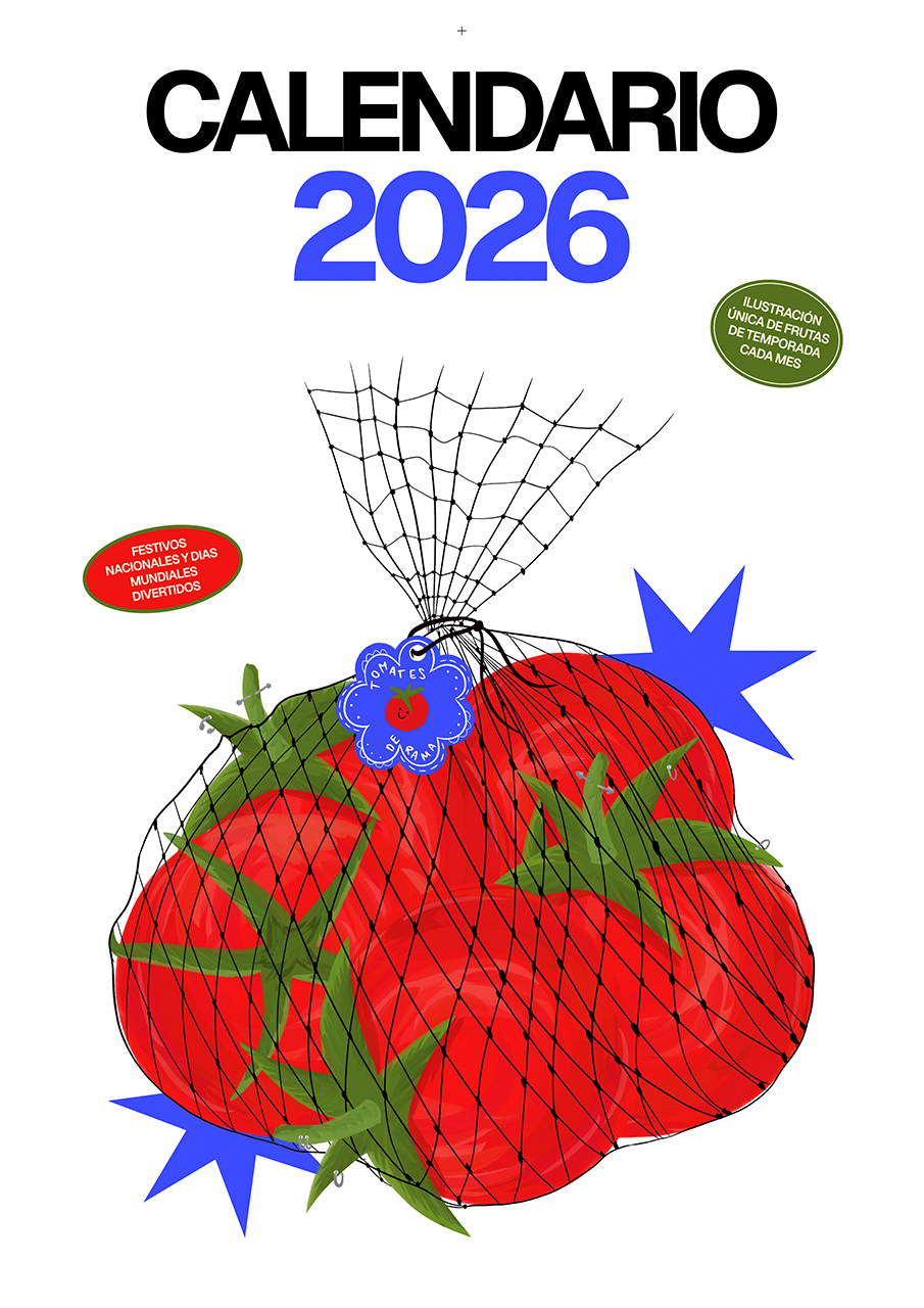
2026 Calendar
2025
01 ABOUT
This 2026 calendar was designed and illustrated entirely from scratch, based on the concept of creating a calendar in which each month represents a seasonal fruit from Spain. Alongside the visual aspect, special attention was given to functionality by including national public holidays, as well as a selection of playful and lighthearted international awareness days that reinforce the calendar’s relaxed and humorous tone. Full and new moon phases were also included, along with ample space for users to write down events and notes directly on the calendar.
02 ILLUSTRATION
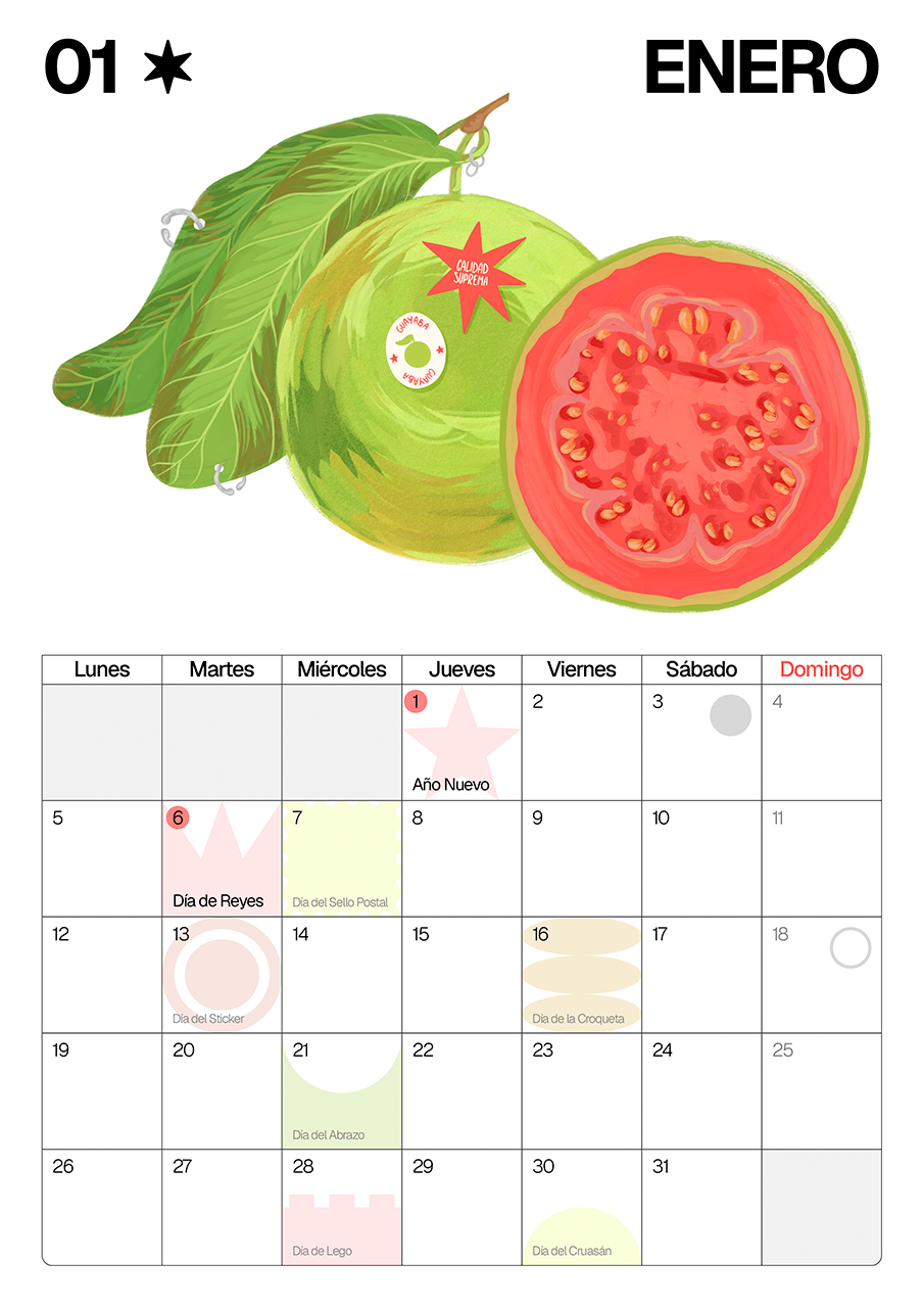
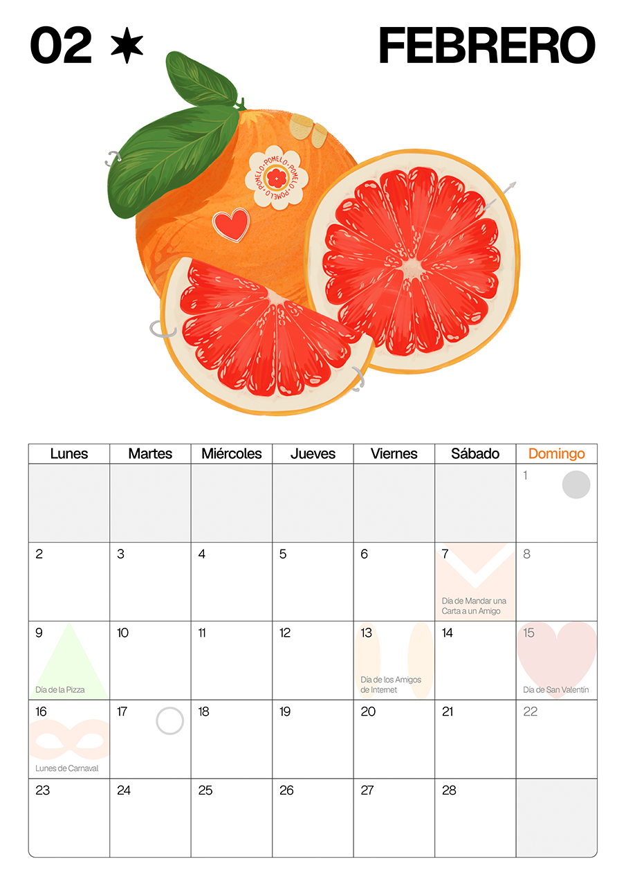
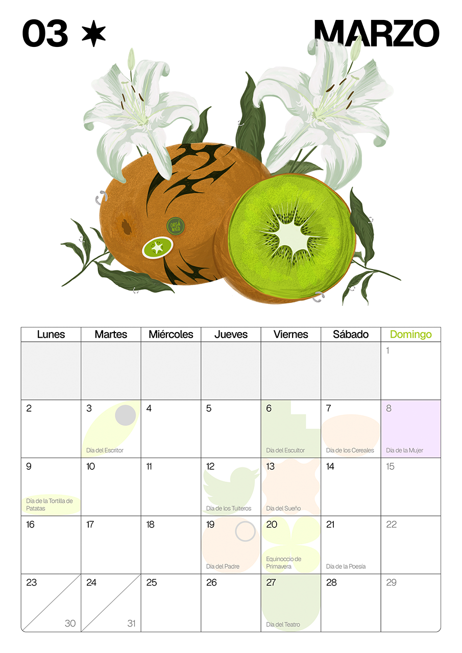
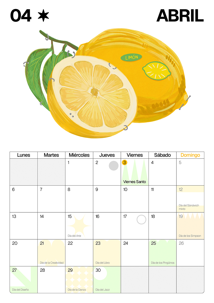
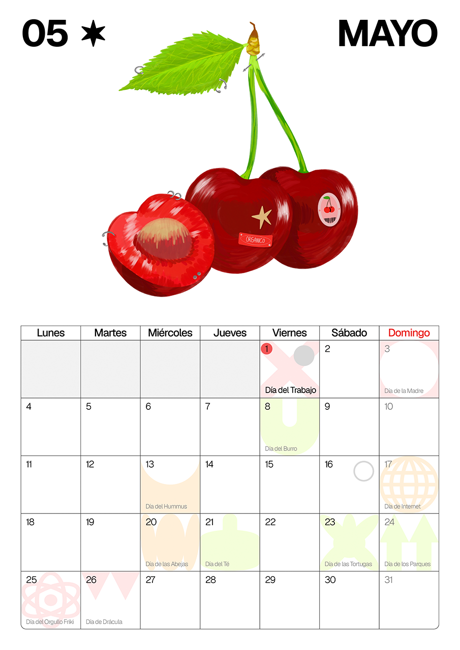
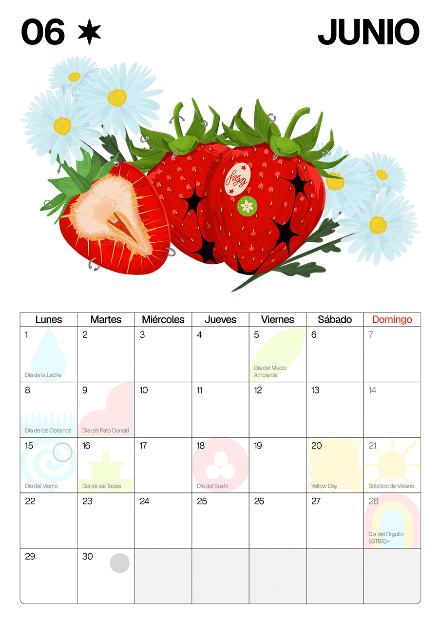
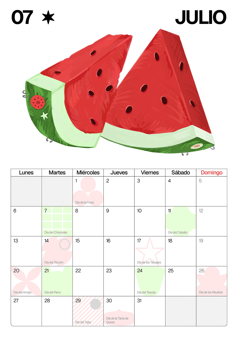
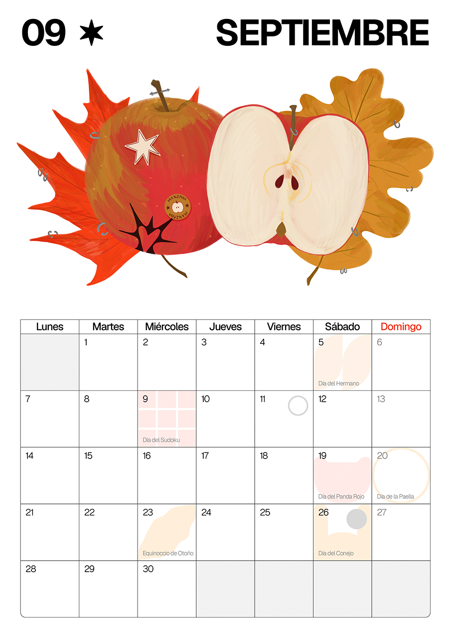
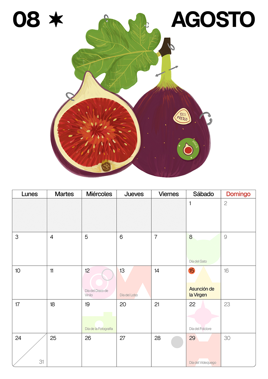
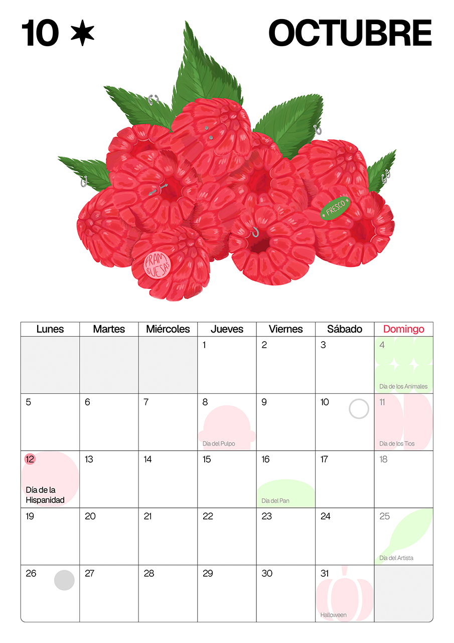
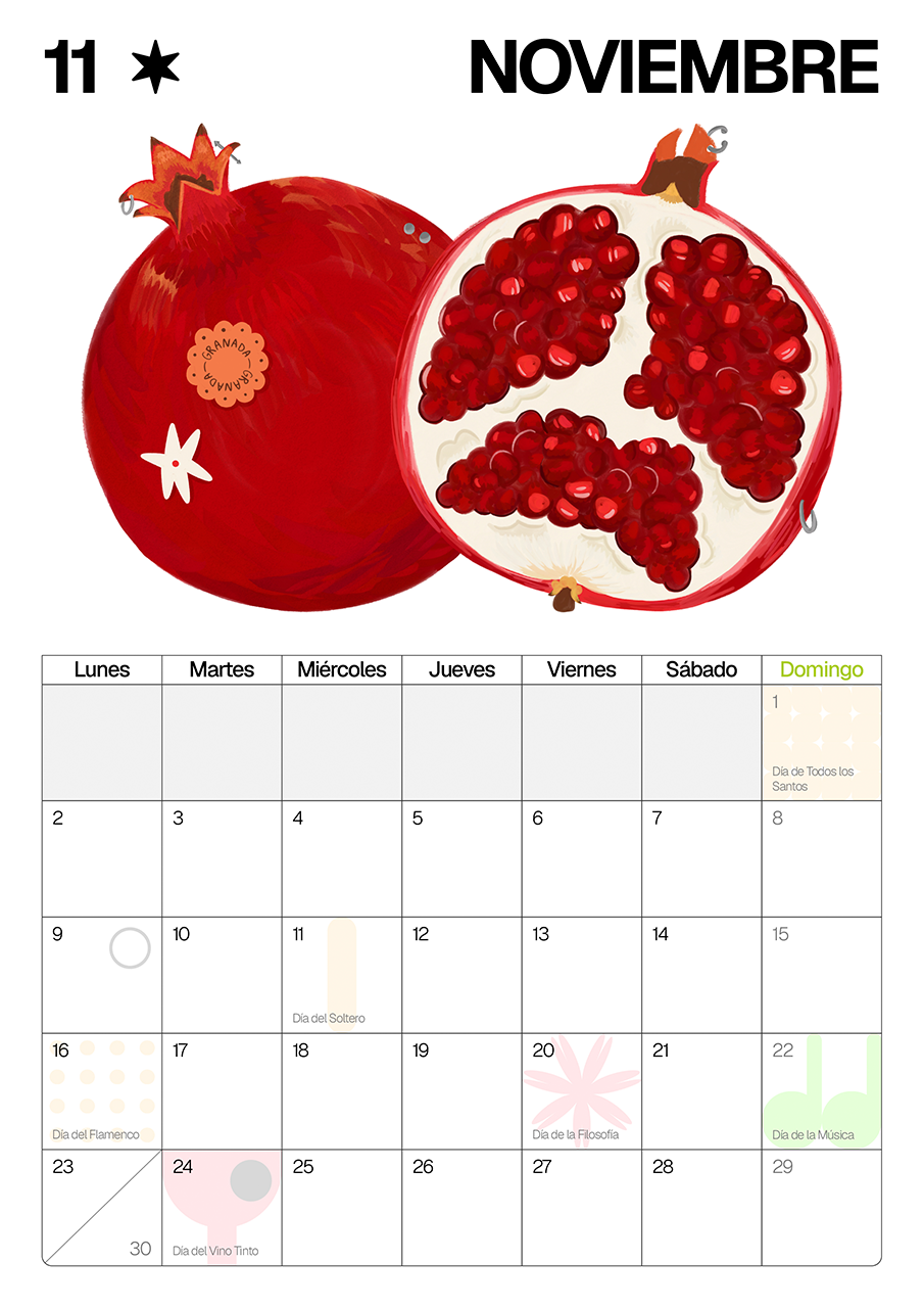
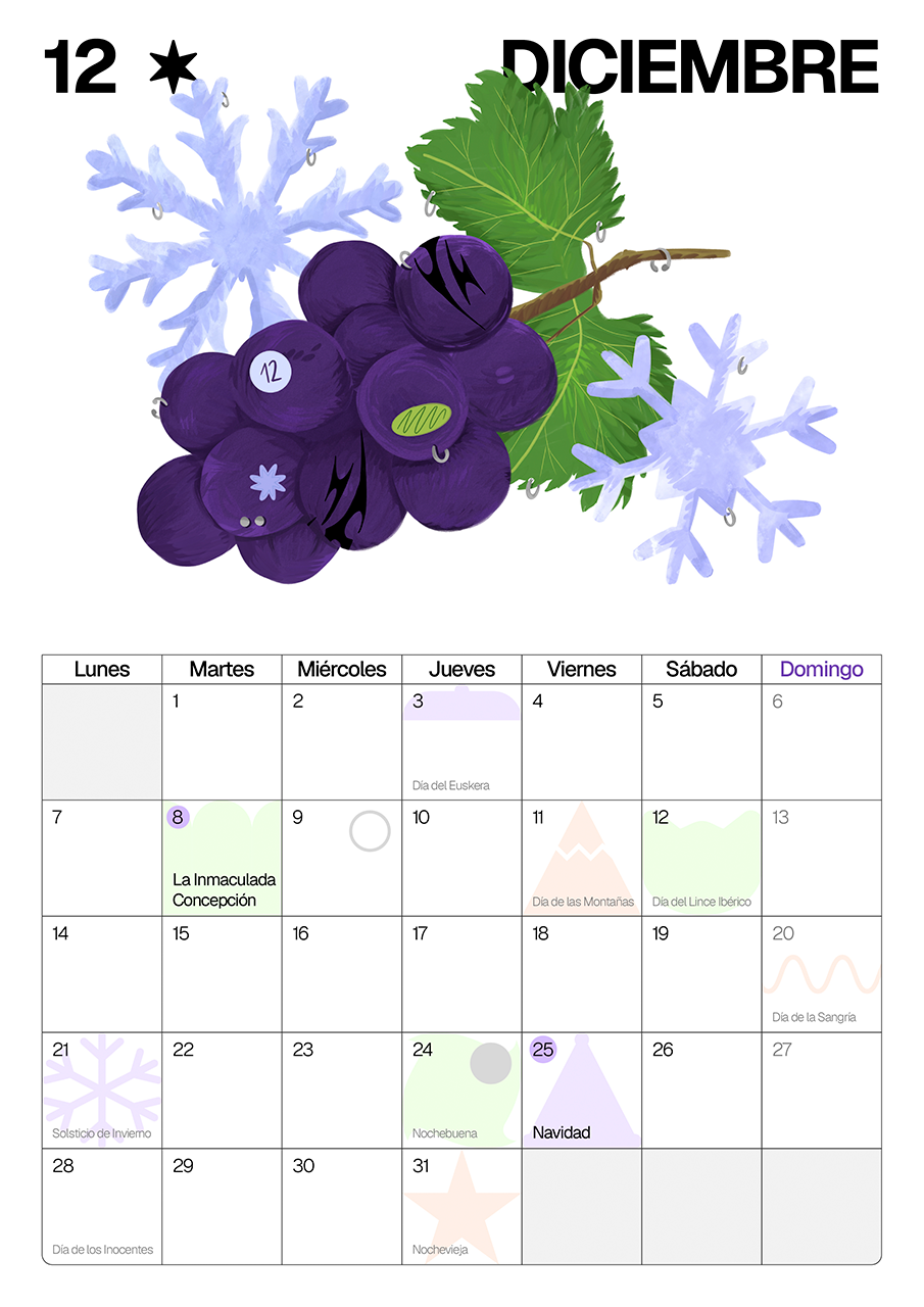
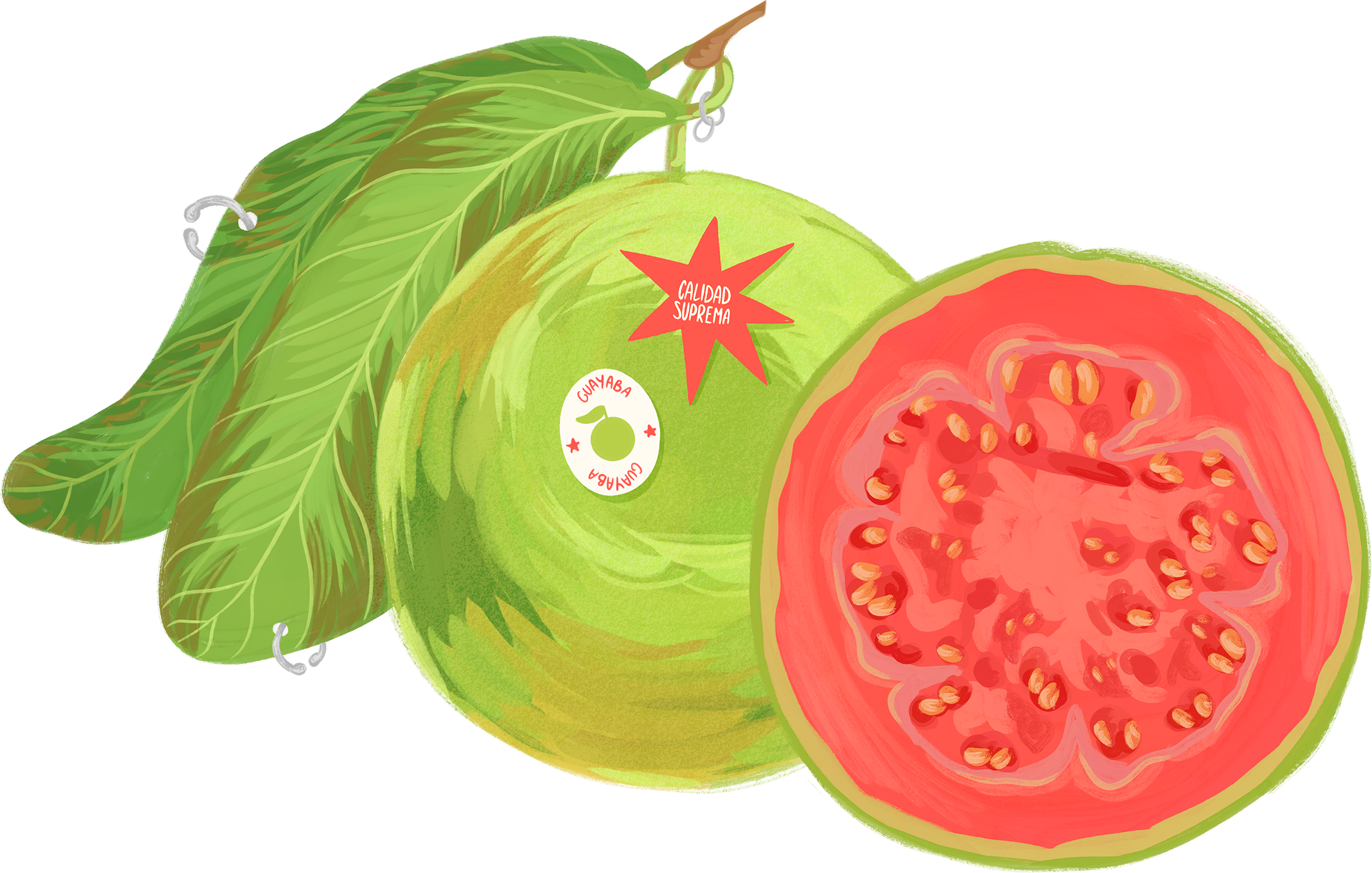
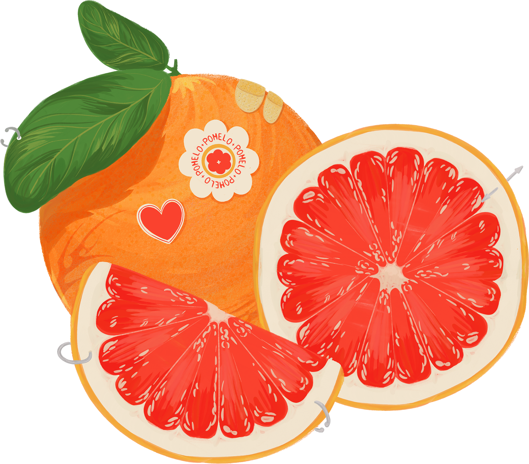
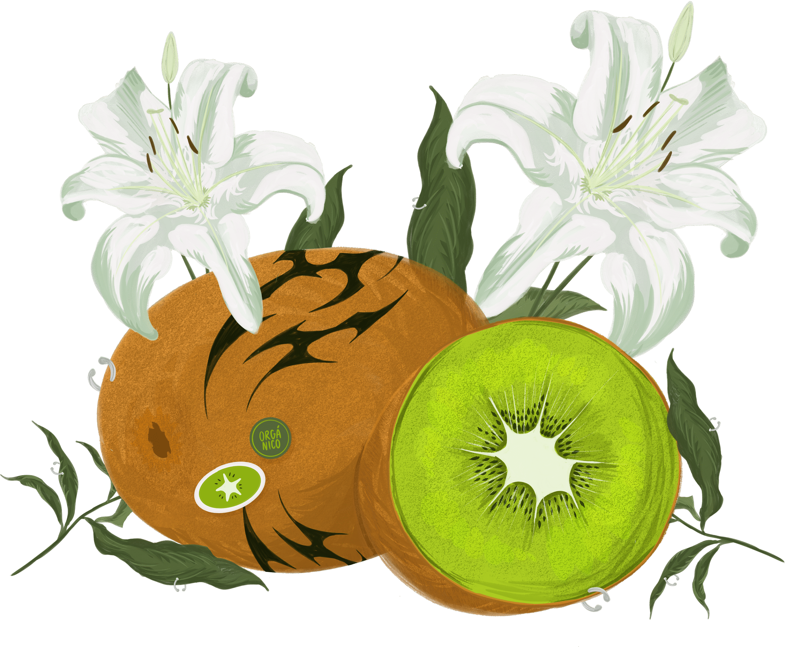
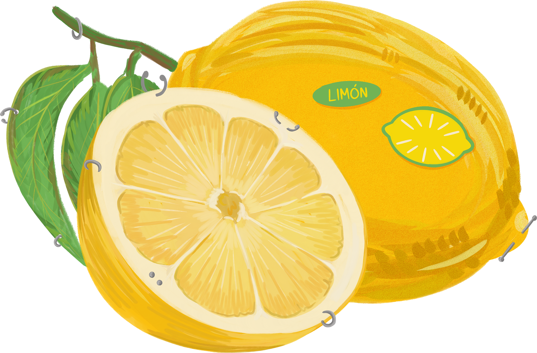
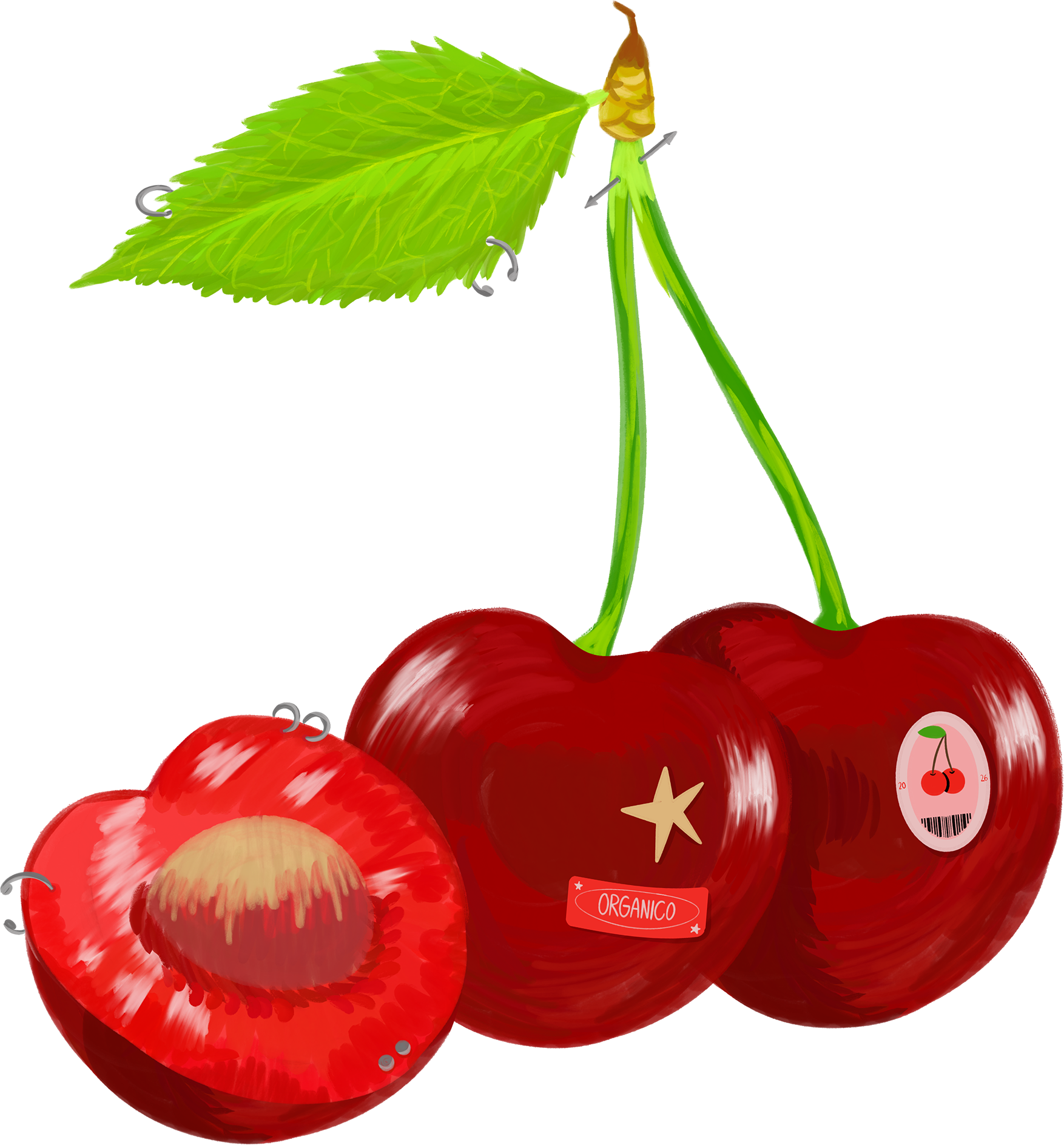
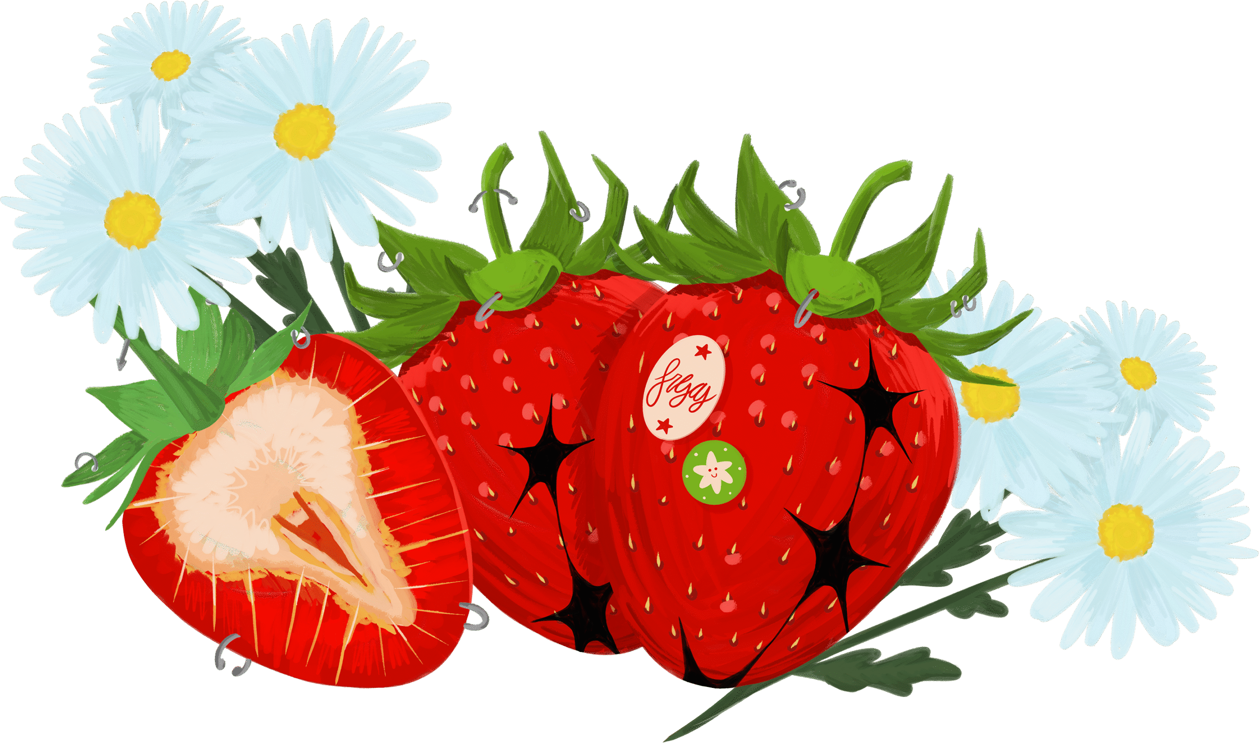
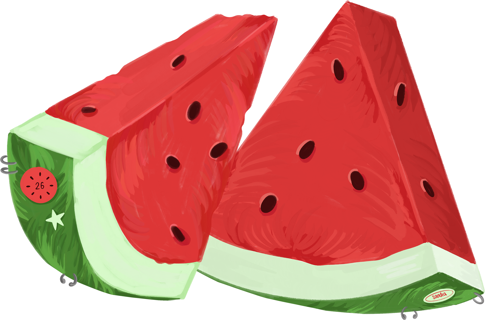
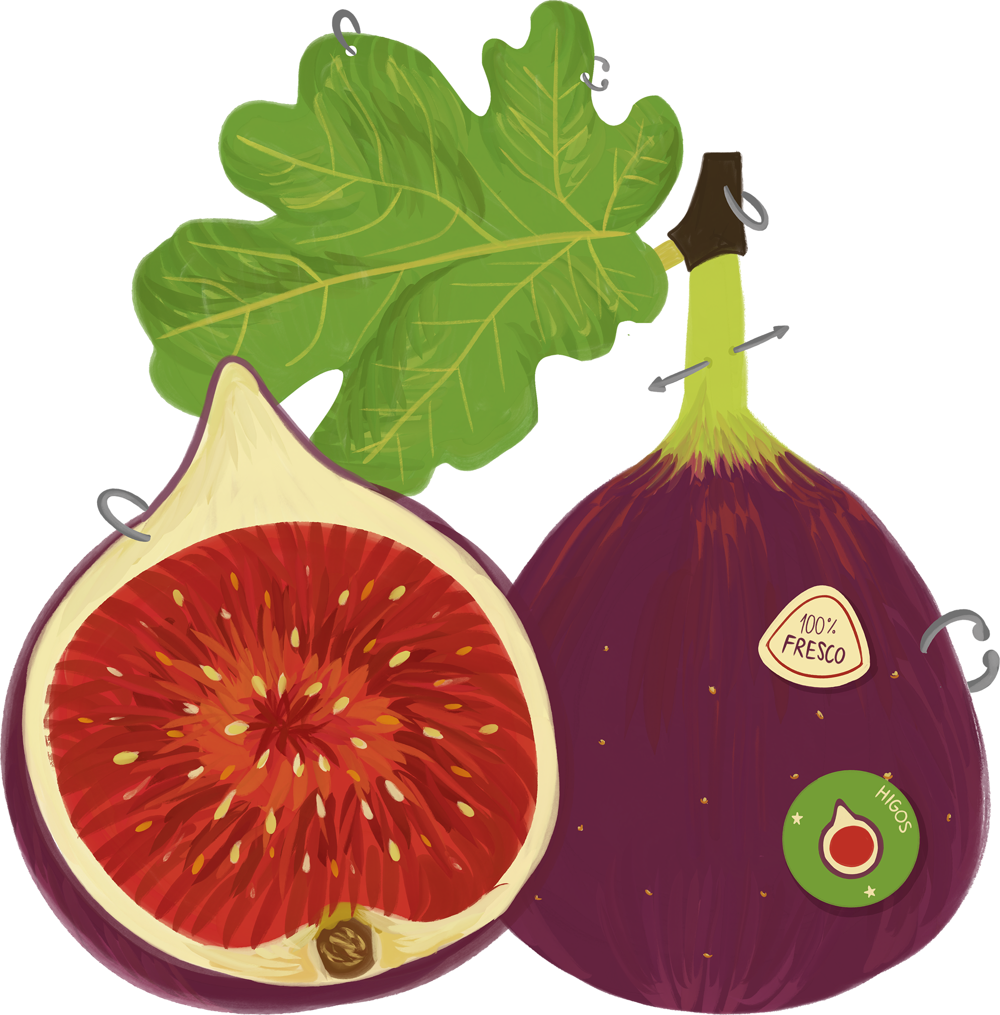
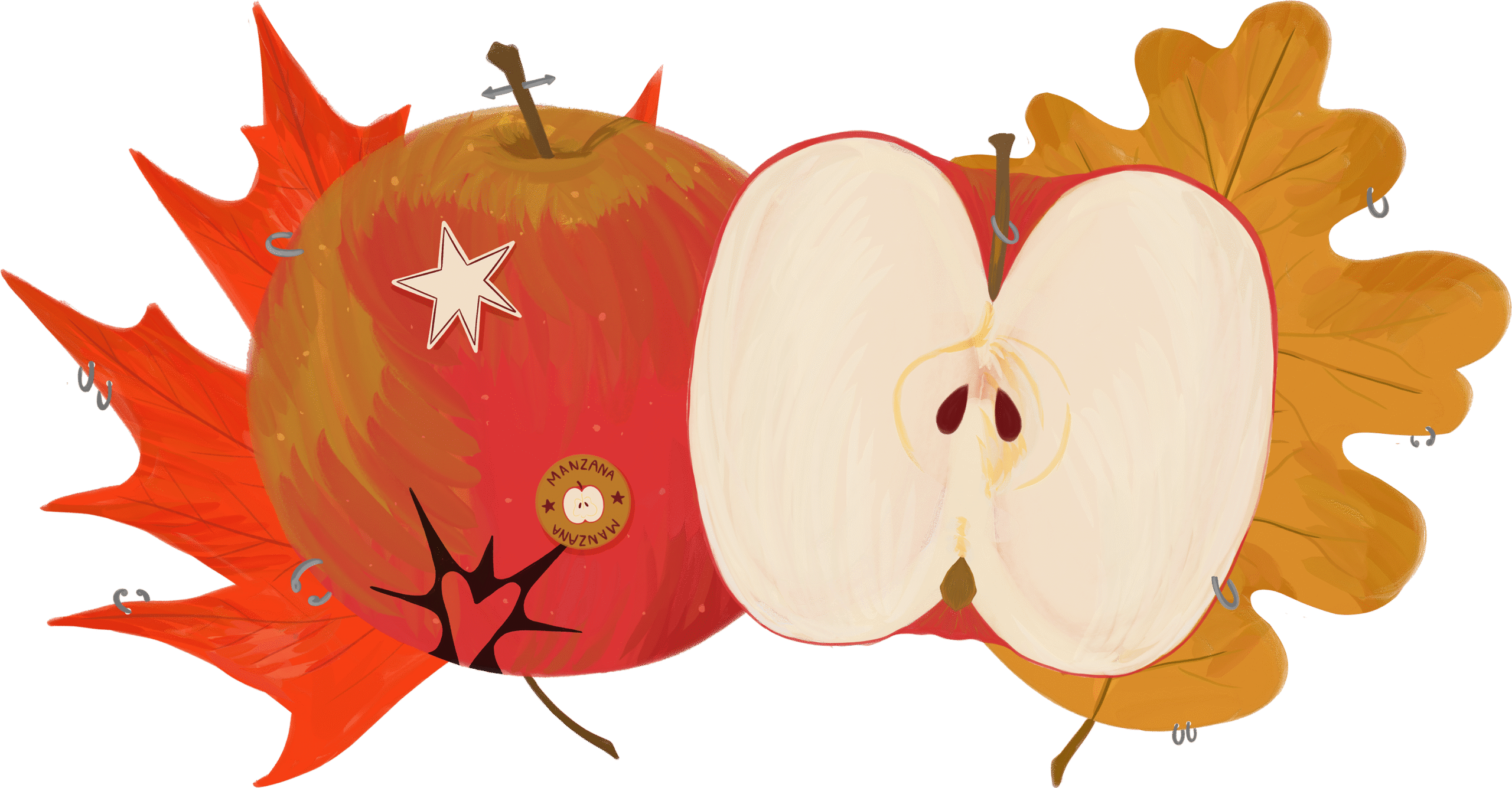
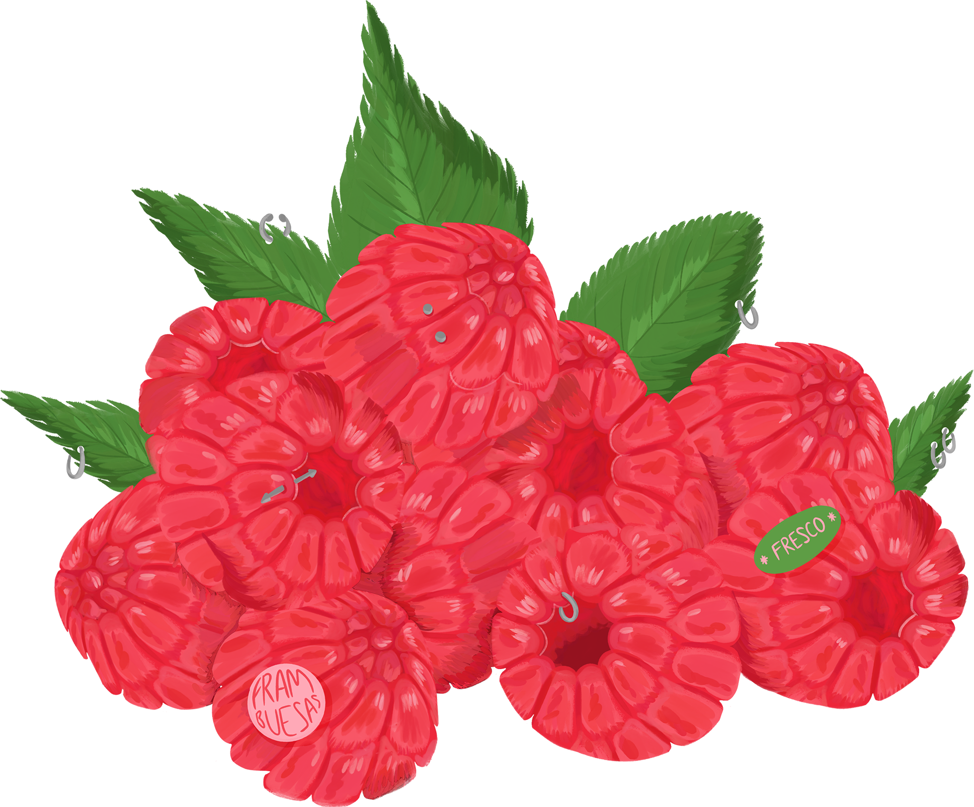
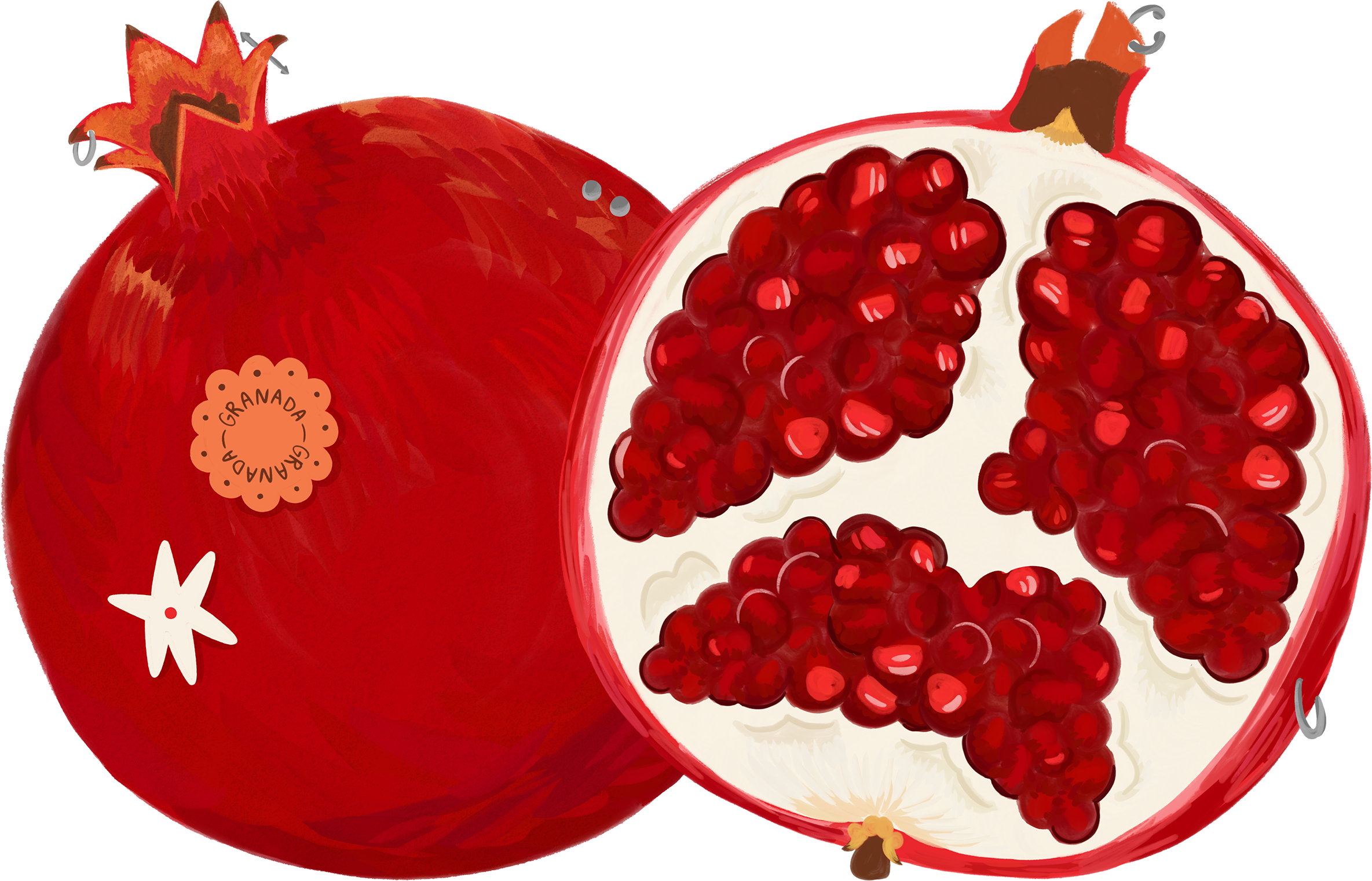
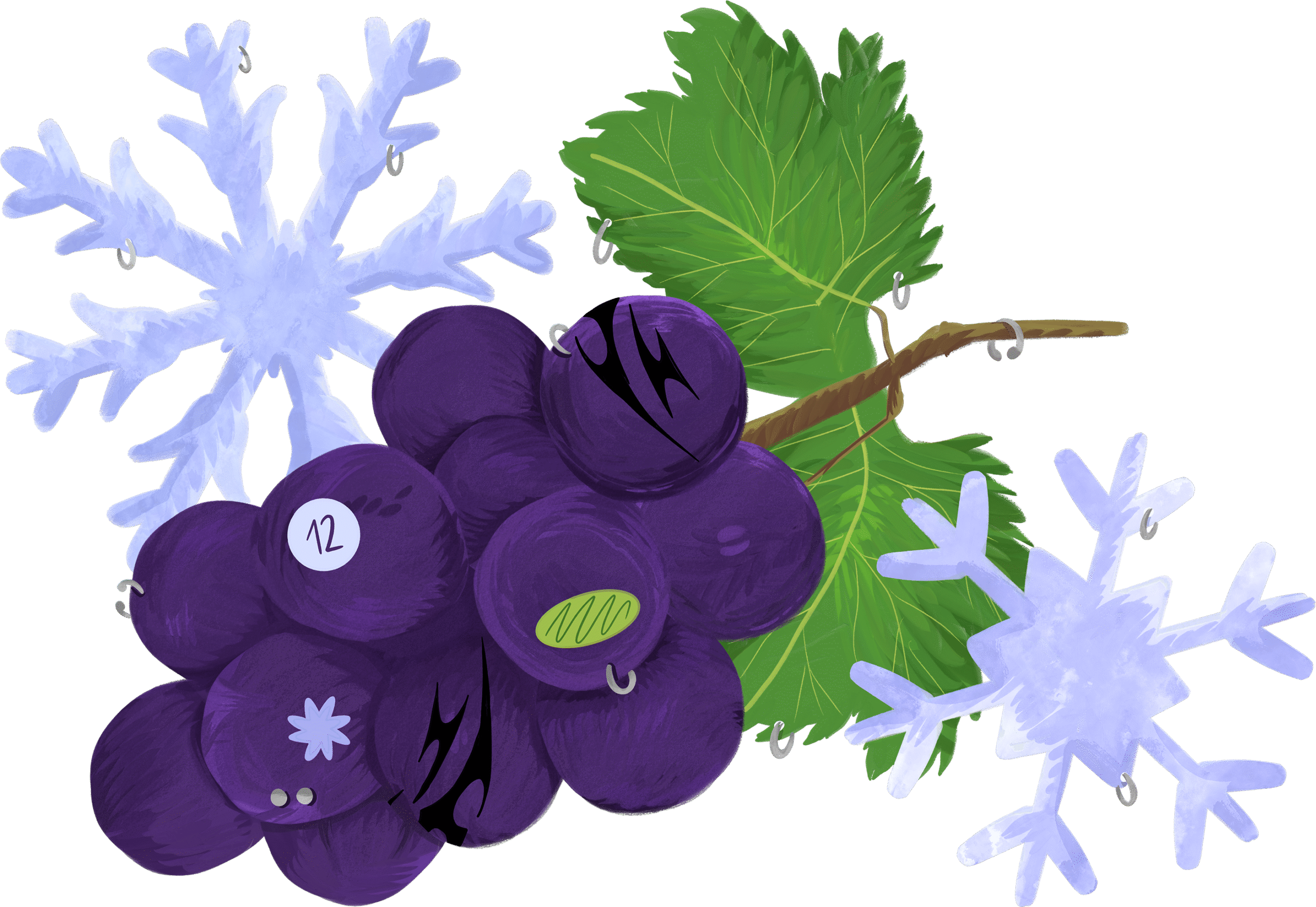
As mentioned previously, each month is represented by a different seasonal fruit. January features a guava, followed by a grapefruit in February, a kiwi in March, a lemon in April, cherries in May, strawberries in June, watermelon in July, figs in August, an apple in September, raspberries in October, a pomegranate in November, and grapes in December. Grapes are the only fruit that are not strictly in season, but they hold strong cultural significance during this month. Each illustration is enriched with small details such as fruit stickers placed on the fruits themselves, decorative elements like piercings, and subtle motifs such as small stars, all of which are characteristic of my illustration style.
The fruits representing months in which the season changes include additional symbolic details that are accompained by tattoos in each fruit. In March, marking the transition from winter to spring, the kiwi is accompanied by lilies, a flower strongly associated with the season. In June, the strawberries are surrounded by daisies, evoking early summer fields. In September, which signals the arrival of autumn, the apples are paired with autumn leaves. In December, the grapes are illustrated alongside snowflakes that clearly reference winter.
03 ICONS
Each public holiday and international awareness day is represented by a unique icon, distinct from all others in the calendar. These icons are constructed using simple geometric shapes that interact within the square of each day. Their purpose is to convey the meaning or atmosphere of each date in an abstract and simplified manner. Within the layout, the icons are subtly integrated into the background of each day’s square at a reduced opacity, ensuring they add visual interest while still allowing users to write over them without compromising the legibility of the numbers.

04 CONCLUSION
Overall, the calendar was designed to function simultaneously as a decorative object, a design piece, and a practical everyday tool. It was created with the intention of being fully usable by people who rely heavily on writing and organizing their schedules through calendars. At the same time, it aims to be slightly disruptive by combining elements traditionally associated with cuteness, such as fruit illustrations, with elements that are often perceived negatively, such as piercings and tattoos. The result is a balanced and harmonious visual language that reconciles both worlds in a playful and thoughtful way.
Share this project